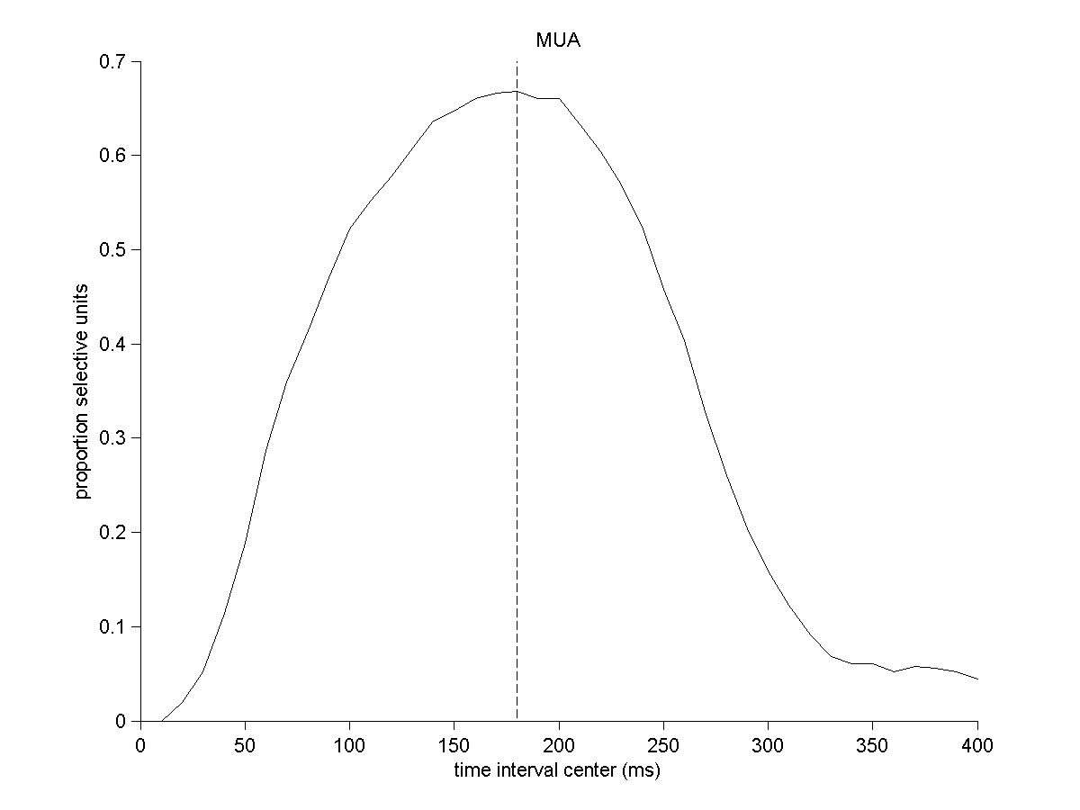
Proportion of selective sites as a function of the spike count time interval.
All intervals were 200 ms in length here and were centered on the value indicated
in the x-axis in the plot.
For each interval, we computed the spike count and performed an ANOVA analysis
to measure whether the variability across the 78 pictures was significantly
different from the variability within repeated presentations of the same picture.
The y axis indicates the propotion of sites where the p value from the ANOVA
analysis was < 0.0001. The dashed line shows the maximum of the curve which
corresponds to the [80;280) ms interval.